Blog
Color Trends for Punjabi Suits in 2026

Choosing the right color for a Punjabi suit used to feel straightforward. Now, with color trends for Punjabi suits shifting faster than ever, what worked two seasons ago can look dated at your cousin’s wedding this year. The good news is that 2026 has brought a clear, wearable set of trending shades that flatter a wide range of skin tones and work across daytime functions, evening parties, and everything in between. This guide breaks down exactly which colors are winning right now, how to wear them, and how to avoid the common mistakes that leave even well-dressed people looking off.
Table of Contents
- Key takeaways
- 1. How to choose colors for Punjabi suits
- 2. Burnt orange: the universally flattering frontrunner
- 3. Sage green: calm, elegant, and surprisingly modern
- 4. Deep teal: the party color that earns its place
- 5. Rust red: tradition with a contemporary edge
- 6. Butter yellow: the daytime celebration color
- 7. Fabric and cut choices that make colors shine
- 8. Color combinations and situational recommendations
- 9. Color comparison at a glance
- My take on color choices in 2026
- Find your perfect color at Punjabithreads
- FAQ
Key takeaways
| Point | Details |
|---|---|
| Top 5 colors for 2026 | Burnt orange, sage green, deep teal, rust red, and butter yellow are the leading shades this season. |
| Avoid neon and pure white | Neon shades and pure white read as dated or impractical for party and festive wear in 2026. |
| Fabric matters as much as color | Lightweight fabrics like cotton silk and Chanderi make colors look more vibrant and feel more comfortable. |
| Gold jewelry is your best friend | Gold pairs universally well with the rich neutral palettes trending this year, more so than silver. |
| Versatility beats novelty | Neutral, rich tones let you re-wear a single suit across multiple events with different accessories. |
1. How to choose colors for Punjabi suits
Before you commit to any shade, a few practical factors will determine whether a color works for you or just works in theory.
Skin tone compatibility is the starting point. Warm skin tones, which lean golden or olive, tend to glow in earthy shades like burnt orange, rust red, and mustard yellow. Cool skin tones, which have pink or blue undertones, look striking in sage green and deep teal. If you are unsure of your undertone, hold a piece of gold fabric and a piece of silver fabric near your face in natural light. Whichever makes your complexion look more alive tells you everything you need to know.
Event timing changes everything too. Butter yellow and sage green are daytime colors. They catch natural light beautifully but can look washed out under artificial event lighting at night. Deep teal and burnt orange, on the other hand, photograph beautifully under warm indoor lighting and hold their depth in the evening.
Fabric texture affects how a color reads on the body. A matte cotton suit in sage green looks understated and elegant. The same color in a silk blend reads richer and more formal. Linen blends tend to soften colors slightly, which is ideal if you want a relaxed daytime look without looking underdressed.
A few colors to steer clear of: neon shades in any form, pure white for party wear (it reads bridal or clinical depending on the context), and heavily printed multicolor suits if you want to stay current. The shift toward neutral rich tones reflects a broader move toward longevity and ease in ethnic wear styling.
Pro Tip: When in doubt about how to choose suit colors, pick one that you can wear to at least two different events by swapping your dupatta and jewelry. That single rule saves money and closet space.
2. Burnt orange: the universally flattering frontrunner
Burnt orange is having a genuine moment, and it deserves it. Unlike bright tangerine, which can overwhelm fair skin tones, burnt orange sits in a warmer, deeper register that works across almost every complexion. It photographs well in both daylight and evening settings, which makes it one of the most versatile Punjabi suit color ideas available right now.
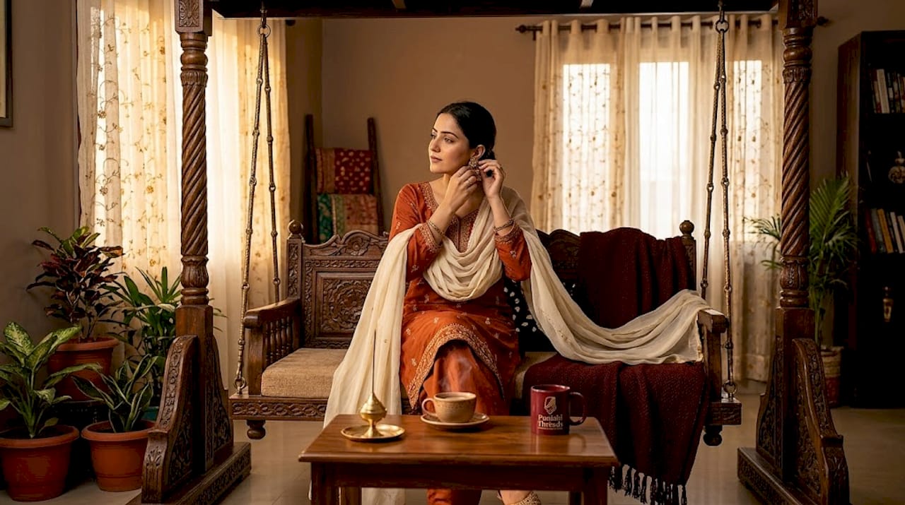
Pair burnt orange with antique gold jewelry and a cream or ivory dupatta for a daytime function. For an evening event, swap the dupatta for a deep maroon or chocolate brown and layer on heavier gold pieces. The color also works well in cotton silk, which keeps the look from feeling too heavy for longer ceremonies.
3. Sage green: calm, elegant, and surprisingly modern
Sage green is one of those trending Punjabi suit shades that looks like it belongs in both a garden party and a formal reception. It is soft without being pastel, and it carries a quiet sophistication that brighter greens simply cannot match.
The key to wearing sage green well is keeping embroidery minimal. Let the color do the work. A simple thread border or a light Phulkari motif is enough. Heavy embroidery in contrasting colors will compete with the shade rather than complement it. Gold jewelry, particularly jhumkas and a delicate maang tikka, pairs beautifully with sage green and keeps the look grounded in tradition while feeling fresh.
4. Deep teal: the party color that earns its place
If you are dressing for an evening event and want to stand out without trying too hard, deep teal is your answer. It is rich, it photographs with depth, and it makes embroidery pop in a way that lighter colors simply cannot.
Deep teal suits are particularly effective when paired with zari or mirror work embroidery. The contrast between the dark base and the metallic detailing creates a visual impact that reads expensive even on a modest budget. For jewelry, this is one of the few shades where mixing metals actually works. Try gold earrings with a silver or oxidized necklace for a modern, editorial feel.
“Avoid matching jewelry sets for a fresh, modern impact. Mixing metals in your accessories is one of the easiest ways to update a traditional look without changing the suit itself.”
5. Rust red: tradition with a contemporary edge
Classic red has been a staple of Punjabi attire for generations. Rust red takes that familiarity and shifts it into something more current. It is warmer, earthier, and less visually aggressive than a pure red, which means it works for daytime events where a bright red might feel like too much.
Rust red also plays well with other trending colors in a family setting. If you are coordinating outfits for a group, rust red pairs naturally with sage green, ivory, and burnt orange without clashing. It is one of the most flexible popular colors for Punjabi attire when you are thinking about group coordination.
6. Butter yellow: the daytime celebration color
Butter yellow is soft, warm, and genuinely joyful to wear in natural light. It suits daytime functions like morning ceremonies, Vaisakhi celebrations, and outdoor gatherings where the light is on your side. For festival outfit inspiration, the Vaisakhi outfit ideas at Punjabithreads show how butter yellow translates beautifully into both traditional and modern silhouettes.
The one rule with butter yellow: avoid it for evening events under warm artificial lighting. It can shift toward a greenish or sallow tone under certain indoor lights, which does neither the suit nor the wearer any favors. Keep it for daytime, pair it with gold jewelry and a white or pale dupatta, and it is one of the most charming fashionable hues for Punjabi suits in 2026.
7. Fabric and cut choices that make colors shine
Color is only half the equation. The fabric and cut you choose determine whether a trending shade looks polished or forgettable.
The 2026 trend toward comfort emphasizes lighter fabrics like cotton silk, Chanderi, and linen blends. These materials allow freedom of movement, which matters when you are dancing at a wedding or sitting through a long ceremony. They also tend to hold color vibrancy better than heavier fabrics, which can make rich shades like deep teal and burnt orange look even more striking.
Popular cuts this season include:
- Asymmetric hems that add visual interest without requiring heavy embroidery
- Straight cuts that work for both petite and tall frames and keep the focus on the fabric color
- Cape jackets layered over straight pants for an evening-ready silhouette that feels modern
For embroidery, less is genuinely more in 2026. Minimal thread work or a single embroidered border lets the color of the suit remain the focal point. Reverse Phulkari embroidery on dupattas is a smart choice because it creates a subtle traditional texture on the front while being far more durable and snag-resistant during active wear.
Pro Tip: When mixing metals in your jewelry, anchor the look with one dominant metal and use the second as an accent. Gold earrings with a single oxidized silver cuff reads intentional. Equal amounts of both metals reads accidental.
8. Color combinations and situational recommendations
Choosing the right color is one thing. Choosing the right color for the right occasion is where most people get it wrong.
For morning functions and daytime events, stick to lighter shades in the trending palette. Butter yellow, sage green, and soft rust red all read appropriately festive without overwhelming the natural light. Pair these with minimal jewelry and a contrasting dupatta to add visual interest without adding weight to the look.
For evening parties and receptions, reach for deep teal, burnt orange, or a darker rust red. These shades hold their depth under artificial lighting and photograph well in flash photography, which matters more than most people admit when planning a wedding outfit.
For family coordination, the 2026 color palette for ethnic wear makes it easy to mix and match without clashing:
- Pair burnt orange and sage green for a warm, earthy family palette
- Combine rust red and butter yellow for a festive, traditional feel
- Use deep teal as the anchor color for one family member and dress others in ivory or cream
A few things to avoid regardless of the occasion: matching your dupatta exactly to your suit in the same fabric and color (it reads flat), over-accessorizing with multiple metallic tones in equal measure, and choosing neon shades in any context. Mustard yellow is worth noting as a practical alternative to butter yellow for evening events because it handles artificial lighting better and hides minor stains more effectively than pastels.
9. Color comparison at a glance
| Color | Skin tone match | Best for | Fabric recommendation | Jewelry pairing |
|---|---|---|---|---|
| Burnt orange | All skin tones | Day and evening | Cotton silk, Chanderi | Antique gold |
| Sage green | Cool and neutral tones | Daytime events | Linen blend, Chanderi | Gold jhumkas |
| Deep teal | All skin tones | Evening parties | Silk blend, cotton silk | Mixed metals |
| Rust red | Warm and medium tones | Day and evening | Cotton silk, georgette | Gold and kundan |
| Butter yellow | Warm and fair tones | Daytime only | Linen blend, cotton | Gold, minimal |
My take on color choices in 2026
I have worked with enough clients at Punjabithreads to know that the most common regret is not picking the wrong color. It is picking a color that only works for one occasion and then never wearing the suit again.
What I have learned is that the neutral rich tones trending in 2026 are not just fashionable. They are genuinely practical. A well-made burnt orange suit in cotton silk can go from a morning ceremony to an evening reception with nothing more than a dupatta swap and a change of jewelry. That kind of versatility is rare in ethnic wear and worth prioritizing over a shade that photographs beautifully once and then sits in your wardrobe.
My contrarian take: I think deep teal is underrated for daytime wear. Most people reserve it for evenings, but in natural light with minimal gold jewelry, it looks extraordinary. Do not let the conventional wisdom on that one limit you.
The other thing I keep telling people is to stop matching their jewelry sets. Buying a full necklace and earring set in the same design and wearing them together is the fastest way to look like you tried too hard. Pick one statement piece and let everything else be quieter. It is a small shift, but it changes the entire feel of an outfit.
Invest in the versatile ethnic wear pieces that will serve you across multiple events and seasons. Fad colors come and go. A well-cut suit in a rich neutral will outlast all of them.
— Punjabi
Find your perfect color at Punjabithreads
At Punjabithreads, we carry the full 2026 trending color palette across a curated range of Punjabi suits in Melbourne, including burnt orange, sage green, deep teal, rust red, and butter yellow in fabrics like cotton silk and Chanderi. Every suit is available for custom stitching to your exact measurements, so the color you choose looks exactly the way it should on your body, not on a mannequin. Whether you are dressing for a wedding, a festival, or a family celebration, our team helps you match the right shade to the right occasion. Visit our Punjabi suits collection to explore current styles and book a custom fitting consultation today.
FAQ
What are the top color trends for Punjabi suits in 2026?
The top five trending colors are burnt orange, sage green, deep teal, rust red, and butter yellow. These shades flatter diverse skin tones and suit both daytime and evening events.
Which colors should I avoid for Punjabi party wear?
Neon shades and pure white are best avoided for festive and party wear in 2026. They either read as dated or carry unintended associations in a celebration context.
What jewelry works best with 2026 Punjabi suit colors?
Gold jewelry pairs universally well with the rich neutral shades trending this year. For evening events, mixing gold and oxidized silver creates a modern look that feels intentional rather than matchy.
Can I wear butter yellow to an evening event?
Butter yellow is best reserved for daytime functions. Under warm artificial lighting, it can shift in tone and lose its appeal. Mustard yellow is a stronger choice for evening wear within the same color family.
What fabrics make trending colors look their best?
Lightweight fabrics like cotton silk, Chanderi, and linen blends hold color vibrancy well and allow freedom of movement, making them the top choices for showcasing the 2026 trending shades.


